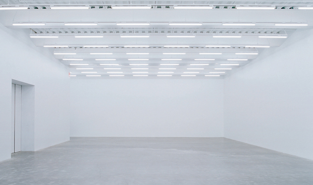
Spacious, clean, white rooms have, throughout the last century, become the standard in both living and gallery spaces. Of course in its conception Modernism was a radical departure of the dark, upholstered, and often dizzying textured spaces of the pre-War(s) era.
The definite shift of Modernism from the avant-garde experiment into mainstream design took place after WW2, and gradually the Modernist idea of functionality gained momentum – in part because it’s cheaper to produce basic, undecorated shapes than, for instance, walls and ceilings with alcoves, mouldings, and monumental fireplaces. Intricate architectural elements with symbolic meaning got replaced by glass, steel and concrete primitives.
When I applied for art school, the white walls of the studio spaces greatly appealed to me. It was as if they were challenging the students to fill these voids. After some time I started to notice that the walls of exhibition spaces were mostly empty, white walls and light floors, containing some dots of art.
I asked one of our professors why the walls in exhibition spaces were white. He said white is the most neutral background for most art works.
For years, I left it there. I even started to believe it: when exhibiting, your space should ideally be a white box. It’s best for the works.
But the more I read about art history, the origins of art, and the layout of spaces in prehistoric caves used by us humans, the more I started to doubt the idea of white walls as an exhibition convention.
(Obviously: working with video means I may be have a biased anyway against the well-lit white cube gallery space.)
White might look good when youphotograph an isolated work or composition in the exhibtion space. In the fysical conventional Modernist art gallery, however, there’s usually an abundance of space between the art works, meaning there’s an abundance of reflective surface.
The space actually drowns the art. It doesn’t look like an ideal way of presenting art to me.
The first time I ever saw concrete walls as a carrier or frame for art works was, ages ago, in the then recently opened Palais De Tokyo in Paris. I was immediately convinced: concrete provided the matte, unreflective neutrality that clean, white walls simply can’t.
At the same time, on a different level: concrete approaches the rock surfaces of Upper Paleolithic caves.
Since then, I’ve been experimenting with murals, light, wallpapers, and tight clusters of art works, in order to get rid of the Convention of the White Wall.
I propose the perfect gallery to be made out of bare, concrete surfaces. This might not be best for every work of art, but white walls are suitable for only a small minority of art works, works that can compete with the reflection, or make use of the meaning of a spacebar in their visual language.
A white wall emphasises the space, and its shortcomings. It accentuates cables, cracks, uneven surfaces, plugs, and construction faults.
A white wall should be an option, a solution for a specific exhibition or artwork, instead of the unwritten convention it is now.
Read more:
- I wrote about this subject before. De Vierde Wand, 2011
- The advantage of white is that it saves the curator having to choose. The Guardian, 2011
- As the 80 years since MoMA’s first revolutionary show make clear, it’s no easy feat to think outside the cube. Artsy, 2017
- For many galleries, a variety of white will remain a safe bet: it is a colour unlikely to draw criticism from artists and art patrons, and it saves the curator from having to consider different options. Zimmerman, –
- How did we get here? Hopes&Fears, –
- Inside the White Cube. Brian O’Doherty, 1976